Archivio

Archivio per la categoria ‘Design’

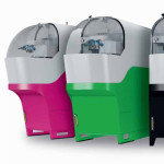
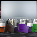
Swiss Type Lathe of the Future, SwissNano from TORNOS

4 Maggio 2015 Nessun commento

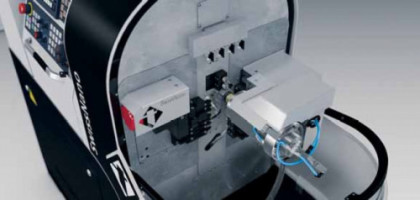
Tornos has a well-established reputation in the field of bar turning for watchmaking, but never before the launch of SwissNano had a manufacturer gone so far ahead in design, ergonomics and integration research into a human-machine interface with a radical focus on efficiency and simplicity.
 

Swiss, Type, Lathe, Future, TORNOS, Swissnano

Front, side and back fantastic ergonomic access.

For more than 100 years, Tornos has been manufacturing machines aimed at watchmaking with theirs Swiss Type Lathe, and for around twenty years, the company has been providing NC solutions to meet highly specific watchmaking requirements (Deco 7 & 10, Micro 7/8, Delta 12 and EvoDeco 10, to mention only a few). Therefore, the company knows the market and has had its engineers pull out all the stops to develop a machine whose design stands out resolutely against other products in the market. The aim: to create a new category.

The SwissNano marks a break from the rest of Tornos’ Swiss-Type lathe range in terms of the design and concept of the machine; its aim is an ambitious one. Fully manufactured in Switzerland, it must meet very stringent cost requirements, to be able to counter Japanese and Korean competition, often manufactured in low cost economies. The SwissNano is a demonstration of the performance that the Swiss industry can offer.

Combining all aspects of design

It is well known that design must bring together two aspects: aesthetics, which plays on emotional effect, and the practical aspects that work on both a rational and emotional level. Mr. Renggli, the Tornos Marketing Manager, told us : “We wanted to create a modern automatic turning machine with a 4mm capacity, occupying minimum floor space and with complete 180° access; hence this frontal design, and the integration of a tablet in addition to the conventional control.”

Frontal access: complete freedom of action

Given the space constraints in watchmaking workshops, the machine was developed so as not to require any rear access. If necessary, it can even be placed against a wall. The machining area is protected by a ‘bubble’ and is accessible from all sides. Mr. Renggli, reports: “The setup is user-friendly, not only is everything easily visible, but it also gives us ideal accessibility. We had a very positive experience.”

Foolproof repeatability and precision

The machine’s structure is designed to meet the most demanding needs of the watchmaking industry in terms of precision, repeatability and surface finishes. Thanks to its flexibility, the SwissNano is a competitive solution which effectively meets the needs of the watchmaking industry (amongst others), proving to be the perfect partner for producing any type of small part. The SwissNano may be small, but you will be surprised at its great performance and flexibility.

Setting, monitoring and interaction

The greatest advance may be in terms of communication. SwissNano has a graphic tablet on top. All the basic production data its reported on this interface. At a glance, the operator can access all the data for a specific machine or for the whole fleet. Tablet connectivity provides a number of other services. Therefore, it incorporates an application that allows machine production to be remotely monitored. The SwissNano can communicate with an Android® tablet via a standalone Wi-Fi network, which it’s created between the machine and the tablet. This application allows information on the machine state, the production status and the plan for the work piece currently being created on the machine to be brought up and displayed, along with the service and maintenance instructions, alarms and their troubleshooting methods. All of this is available in a modern, practical interface. What is more, the application is not limited to one machine; it allows an entire workshop or a bank of particular machines to be monitored. The machines and the application are not connected to the Internet or to any network. The machine and the tablet create their own networks automatically. The application recognizes the machines in the workshop and communicates with them via their own network. With concerns over confidentiality.

 

Margherita: The Sustainable Italian Lamp

27 Gennaio 2015 Nessun commento

Sustainable design firm Izmade releases lamp with an eco-friendly production process and modern design


Margherita, sustainable lamp, creative, design, Izmade, Torino, lampada sostenibile


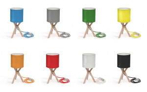
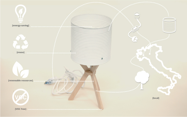
Izmade, a sustainable design collective from Turin, Italy, released their Margherita lamp this December for international production. The Margherita lamp is one of many products from Izmade’s line of sustainable furniture and home accessories.

“The Margherita lamp embodies our entire self-made, sustainable philosophy here at Izmade”, said Izmade’s founders. “Every day Turin alone over 15,000 tomato cans are used by restaurants and thrown away. Instead of leaving this problem untouched in our community, we saw it as an opportunity to create something innovative and beautiful, while simultaneously helping the environment.”

Izmade, Margherita, colors, sustainable lamp

The Izmade design philosophy aims to bridge the gap between environmentally friendly materials and passionate design. They aim to showcase and enhance the original features of the recycled materials while creating something aesthetically pleasing and functional for the home. This unique design process allows even the most commonplace materials to become something remarkable.


To kick off Margherita’s debut, Izmade is hosting a crowdfunding campaign through the website Indiegogo. All contributions will help Izmade meet minimum order quantities for the local Italian beech tree plywood and soybean adhesive necessary to make the lamp. Using these materials will allow Izmade to continue its commitment to truly environmentally conscious design, even as they expand production of the lamp to a larger audience.

Currently, the Margherita lamp is available exclusively on Izmade’s crowdfunding page. The campaign allows interested customers to donate an amount of their choosing in return for a product or other gift from Izmade. The Margherita lamp is available at a special early-bird price of 47€ through the Indiegogo site, but contributors also have the chance to receive other items from the Izmade line.

For more information about Margherita, visit the Indiegogo crowdfunding page at: http://igg.me/at/margherita-lamp/x/7973917
About Izmade
Izmade, teamBorn in 2012, Izmade is a sustainable design collective from Turin, Italy that specializes in the field of self-made eco-design furniture and home accessories. Izmade’s products are the result of a marriage between a traditional approach to conceptual design and an artisanal, self-made approach to production. Our design process is centered around environmental sustainability and the enhancement of a material’s original features to create something new and beautiful.
This mission is defined by our three areas of focus: use of recycled materials; industrial waste and byproducts; and innovative, certificated materials.

HUMARD AUTOMATION SA, la fiabilité comme leitmotiv

2 Ottobre 2014 Nessun commento

L’entreprise propose à ses clients des presses hydrauliques de haute précision et des systèmes d’automation dans le but d’augmenter la productivité
et la facilité d’utilisation des installations industrielles.

Enrique Luis Sardi designer milano suisse switzerland svizzera Schweiz high precision swiss made hydraulic press

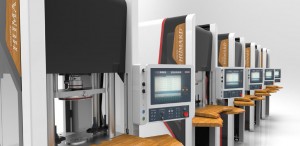
Le design innovant des Servo’Presses hydrauliques CNC HUMARD ® allie productivité élevée et ergonomie

HUMARD Automation SA, Delémont, a été créée en 1995 par les frères Georges et Raphaël Humard, tous deux directeurs généraux. Georges est responsable de la partie commerciale alors que Raphaël dirige la R&D et la production. L’entreprise a débuté en développant des solutions de robotisation pour les presses hydrauliques et, aujourd’hui, HUMARD Automation SA est spécialisée dans la conception, le développement et la fabrication de machines hautement automatisées ou robotisées. Son assortiment compte six lignes de produits, à savoir les presses hydrauliques de grande précision, les systèmes d’automatisation de la production, les robots de manutention, les automates de palettisation, les décolleteuses de haute précision ainsi que les accessoires et dispositifs divers. Tous les produits sont conçus pour accroître la productivité des installations industrielles, véritable défi pour les entreprises en Suisse qui se doivent de produire à très haute valeur ajoutée pour rester concurrentielles.

Si HUMARD Automation SA a su se forger une belle réputation, c’est grâce à des valeurs sur lesquelles aucune concession n’est envisagée. En 1er lieu, la qualité et la fiabilité des machines livrées chez le client et, ensuite, une solide capacité d’innovation, à travers un bureau de R&D d’une quinzaine de personnes (près de 30% de l’effectif  total), animées d’une véritable capacité d’observation et d’anticipation du marché.

Des systèmes sur mesure et modulables

A l’aide de modules standardisés, HUMARD Automation SA combine les éléments pour réaliser des solutions sur mesure, adaptées aux besoins spécifiques du client. L’interchangeabilité des modules offre en outre une grande flexibilité ; une chaîne de montage peut ainsi être modifiée en tout temps, et avec une interruption de travail minimale.

Trois entreprises complémentaires

Georges et Raphaël Humard font preuve d’un véritable esprit d’entrepreneurs, ne refusent aucun défi, mais sont attentifs à une évolution maîtrisée de leur société. Pour  soutenir le développement, deux entreprises ont été acquises, offrant synergies et complémentarité.

En 2002, New Ingenia SA, distributeur exclusif « Bosch Rexroth » pour la Suisse romande, a été rachetée et transférée à Delémont. Elle conçoit, monte et vend des installations complètes intégrant des profilés en aluminium telles que postes de travail, systèmes de convoyage et châssis d’installations diverses.

Seuret SA, spécialisée dans la révision de machines, notamment à cames, a, quant à elle, été reprise en 2011. Le mariage entre la force industrielle de HUMARD Automation SA et les compétences microtechniques de Seuret SA a permis la commercialisation d’un tour automatique de haute précision
combinant savoir-faire ancestral et technologies de pointe.

Enrique Luis Sardi Matija Maticevic Stefano Ghiglione Silvio Marangoni sardi design team

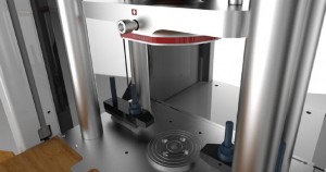
Gros plan sur la zone de travail spacieuse de la Servo’ Presse hydraulique

Les clients d’HUMARD Automation SA sont issus de l’horlogerie, la joaillerie, l’électronique, le médical, l’alimentaire ainsi que l’automobile. HUMARD Automation SA est très bien implantée en Suisse et une expansion vers certains marchés étrangers ciblés est en cours. Pour abriter ses activités, l’entreprise a bâti quatre usines dans la zone industrielle La Communance à Delémont. Une 5e halle, destinée à Seuret SA, est opérationnelle dès cet automne. Côté personnel, une septantaine de collaborateurs travaillent pour l’ensemble du groupe, y compris des apprentis dessinateurs sur machines et automaticiens.

HUMARD Automation SA, qui avait obtenu le soutien de la Promotion économique lors de son démarrage est aujourd’hui un fleuron de l’économie jurassienne.


Humard Innovation and Design team

Source: EnPlus

Good examples of Swiss Made

18 Settembre 2014 Nessun commento

swiss made, quality, precision, girod tast, girod instrumentsSwiss Made is a registered trademark that denotes products that are made in Switzerland. It is such a value for the manufacturer and the consumer that its designation is regulated, protected and controlled by Swiss law.

The Swiss Made designation has earned a reputation as a warranty of good sustainable products that is built with great precision through centuries of manufacturing quality products in Switzerland. It gives consumers a sort of guarantee about the quality of the goods they are purchasing and manufacturers can further profit in greater sales gained by the high consumer confidence from such a prestigious reputation.

The Swiss Made designation is an asset for Swiss companies to leverage in a competitive marketplace. In today’s global economy, a manufacturer must compete with goods made across the world. In order not only to survive but to be chosen by the customer as the best, the Swiss manufacturer must be competitive in the national and international market as well. This is why it is very important that Swiss Made goods deservingly earned a stellar reputation that is widely recognized and respected worldwide.

Today, Switzerland is regarded as having one of the world’s most powerful and stable economy. This is due to its strong manufacturing base as well unprecedented and continuous high quality that can be dated for hundreds of years. The solid and traditional quality of Swiss Made also contains latest know-how, industrial and scientific. In this way, the Swiss Made goods attract and reach a broad range of interested customers, even those who are ready to pay the ultimate price for such a remarkable product. It’s a win-win business for the Swiss Made goods producers and their customers.

Under the Swiss Made label, Swiss manufacturers have earned a worldwide fame for quality goods with durable reputation. These companies are recognized and accepted in many well-known areas of international industry. In addition to this, they can also surprise us in their visionary way by thinking in creating their own successful business in the market niches or supply professionals with unique products.

One of such company is Duvoisin Guitars SA. It is a Swiss manufacturer located in Neuchatel, Switzerland.  This company may not be known to many but for connoisseurs of electric guitars and basses this brand has world-class prestige. Like the traditional Swiss watchmakers, Duvoisin produces their musical instruments with great precision. They created internal six steps technology’s guide-line in order to achieve the highest quality product. It begins with the wood selection, its cutting and careful aging in the company workshops. Further it continues through the various stages including sound transmission, the geometry of the neck and precision in the positioning of the frets. Finally it finishes with the truss rod and touch markers.  To achieve this outstanding quality, in addition to the internal six steps rule, the company employs high qualified professionals, makes the guitars from exquisite woods as well uses special machine locally developed.  And it is not a surprise that they are testing the suitability of various Swiss’ woods for making instruments. Also since 2007 the company has been manufacturing basses from the Swiss wood. Duvoisin’s electric guitars and basses are produced in full compliance with the principles of Swiss Made goods.

Another example of Swiss Made are products of FELCO, a company which was created in 1945 by Mr. Félix Flisch a legendary, self-taught visionary. To start production of his first pruning shears he bought an old watchmaking factory. If it was just a coincidence, or destiny indicating that his products are so finely crafted as Swiss watches? The truth is that today, FELCO manufactures not only pruning shears unlike any others but offers tremendous assortment of pruning and cutting products to his clients in over 120 countries. The company is based in Les Geneveyes-sur-Coffrane, Switzerland. In the FELCO catalogue customer can find three general products classifications: “Green,” “Industrial” and “Power-assisted” for professional and leisure use. It sounds very simply but behind these three categories are wide range of goods offer to the client. It starts with the “universal cutter” and finish with “pneumatic and electric tools.” FELCO tools are used in various domains. They are widely used in agriculture, automotive industry, civil engineering and aeronautics, telecommunications, fishing and harbour activities as well many others.  The manufacture not only produces excellent tools but also offers accessories and service to maintenance the highest quality and longtime use of their products. When a new product is created the entire design team attention is focused on the smallest detail. The unique quality, perfection in accuracy and execution as well customer pleasure in using the tools are the base of Swiss Made brand.

A New chapter in Swiss Made knives is a cooperation between FELCO and VICTORINOX.
The two Swiss companies using label Swiss Made, proudly marked in a co-branding agreement a “Grafting and Pruning Knife.” The knife is produced by the manufacturer of Swiss knifes Victorinox.

Victorinox has been in business since 1884 and it is probably not always synonymous with cutlery, but it manufactures one of the world’s best-selling pocket knives, the Swiss Army Knife. Since 1891 Victorinox has been supplying officially the Swiss military with these pocket knives that would eventually become the Swiss Army Knife. As Victorinox knives got renowned, Mr.Karl Elsener, the company founder decided in 1909 to distinguish his knives from copies by using the white cross and red shield as company brand. Slowly but strong, the company was recognized for excellent quality production of original knifes and became one of the leaders in manufacturing cutlery.  1978 was a big moment and a huge recognition for the unique Swiss Made quality of Swiss Army Knives when the first time 50 Master Craftsman knives, model # 5044 were purchased by NASA. Nowadays the Swiss Army Knife is part of the standard equipment for the crew on space missions. Company reputation for durability and reliability is second to none extending a lifetime warranty for those who purchase their products. In addition to the well know production of world-class professional and household knifes Victorinox offers pocket tools, timepieces, travel gear and fashion. All these goods represent Swiss Made quality at every stage of their production. They are masterpieces of quality and latest technology with the roots in a revolutionary idea from 1884 of Mr. Karl Elsener.

In such a distinguish company it could not be missed the Girod Instruments, a Swiss manufacturer measuring instruments of superior precision. The company products are noticed for their Swiss Made solid quality and neat appearance. In 2014 the company is celebrating its 50th anniversary of the successful business. The business is located in Court, in the middle of the Swiss Jura, a region which is well-known as a historical base for manufacturing the famous Swiss watches. Be a part of the living watch industry tradition influenced the products of Girod Instruments.

The company develops measuring instruments as well customized products on request. The main area of the business activity of the company is micro-mechanic. A company’s own product the Girod-Tast is a lever indicator. A part of the Swiss Made quality is an outstanding service. That is very much in line with the Girod Instruments philosophy, because the company manages the repairs of the products directly within its own locations.

Swiss Made is a legacy and philosophy for companies, which are located in Switzerland and desired for the highest quality and standard of their products. The companies pay attention to the smallest detail of their product and respect customer’s well-being.
The Swiss Made trademark is most known for the reliability and precision and is always proudly displays on product which meet the requirements.

By Ella Salzmann


SwissNano – Success in the USA

18 Settembre 2014 Nessun commento

Actually the machine has already been sold a few time in the US and results seems promising. The first machines were sold to Petron Automation, a Connecticut shop proud owner of the first two SwissNanos in the US.

Tornos, SwissNano, Sardi Innovation, Enrique Luis Sardi, high precision lathe19 new machines

Last November, Petron Automation, Inc. held a ribbon cutting ceremony marking its facility expansion. Tornos CEO, Michael Hauser, was there to witness the event. The company, established 34 years ago, added 9,000 square feet to make room for 19 new machines – more than doubling the company’s capacity in 17,000 square feet total.

SwissNano to reach new markets

“These new machines will help us expand our operations and sales further into electronics, connectors…and micro parts, which we see as having huge growth potential,” says Luis Santolamazza, VP Sales & Marketing. He continues: “Getting the first two SwissNanos in the country, shows our President’s commitment for the latest technology. That has always been part of the strategy here and having these new machines supports the point that we invest very regularly in the newest technology (we turn over our machines every 5 years). It’s important to mention that these first two SwissNanos in the country were proven reliable making precision parts for the watch industry in Switzerland…and the purchase of these machines shows that we are trying to step ahead of technology.”

By Pierre-Yves Kohler

Source: EuroTec

Apple’s chief of design Jony Ive expands authority over software

28 Maggio 2014 Nessun commento

Apple Inc. (AAPL)’s chief designer Jony Ive, who Steve Jobs called his “spiritual partner,” is gaining more authority over the look of the company’s products.

Ive is taking full control of the team that designs Apple’s iOS software that powers iPhones and iPads. The move coincides with the retirement of Greg Christie, who led software design.

Apple Chief Executive Officer Tim Cook has turned to Ive to set the overall design aesthetic for products, from the shape of the iPhone’s hardware to the look of screen icons. Ive’s first major influence on Apple’s software was last year’s introduction of iOS 7, which featured brighter colors and eliminated many of the realistic designs for applications such as wooden bookshelves and leather-bound contact books.

Christie’s software-design team, which had previously reported to software chief Craig Federighi, will now work directly with Ive, the company said. Christie “has been planning to retire later this year after nearly 20 years at Apple,” the Cupertino, California-based company said in a statement yesterday.

“He has made vital contributions to Apple products across the board, and built a world-class Human Interface team which has worked closely with Jony for many years,” the company said.

Christie, whose name is on several iPhone patents, testified last week in the company’s current trial against Samsung Electronics Co. His departure was first reported by 9to5Mac.com.

Ive, who worked closely with Jobs on products stretching back to the iMac, gained greater control over the look and feel of Apple’s hardware and software after the departure of former software chief Scott Forstall in 2012.


By Adam Satariano

Source: Bloomberg


Tre designer per un brand: ecco KÖKLER

26 Maggio 2014 Nessun commento
KÖKLER, kokler, kökler, koekler, fashion design, kokler fashion, Made in Italy

Una delle creazioni Kokler

Iniziamo il nostro viaggio con KÖKLER, marchio creato quest’anno dalle due sorelle tedesche di origini turche Hatice ed Emine Sagdic, ai quali si è aggiunto Kleant Stasa, albanese. I tre si sono incontrati nel 2007 durante il corso di fashion design presso AFOL Moda a Milano. Nel 2012, Hatice, Emine e Kleant partecipano a due mostre interdisciplinari, durante le quali maturano la decisione di dar vita ad un brand che prendesse le mosse dalla tradizione folkloristica turca, riformulata secondo i canoni sartoriali appresi in Italia. L’artigianalità turca è alla base di un design sì contemporaneo ma non troppo, a riprova dello spirito allo stesso tempo antico e dinamico del loro Paese. Capi puliti nelle forme ma complessi nei tagli e nelle rifiniture: la prima collezione di KÖKLER è dunque un lavoro sull’identità, come è lecito aspettarsi da chi si approccia per la prima volta al mestiere di stilista – o a qualunque altro mestiere, per dirla tutta – percorso che loro stessi definiscono “ad alto carico emotivo”. Ci piacciono perché – sebbene molto ci sia ancora da fare nello sviluppo di questa identità – sono romantici e consapevoli e perché, francamente, hanno scelto delle pizze fenomenali.

Perché scegliere una scuola di moda?
Perché studiare moda permette di esprimersi in modo creativo ispirandosi a settori molto vari, arte, letteratura, filosofia… Ma anche sfruttare le ultime innovazioni tecniche, per esempio per la realizzazioni di nuovi tessuti, o usare nuove tecniche di cucitura, è un mestiere creativo che porta ad un interessamento a 360 gradi del mondo che ci circonda.

Cosa vi ha realmente aiutati a crescere nel vostro percorso di studi? Cosa invece vi ha deluso?
Abbiamo avuto l’opportunità di avere un primo contatto con l’ambiente professionale, e tramite vari stage nel settore siamo stati in grado di collegare direttamente quello che avevamo imparato durante i nostri studi e le reali aspettative del mondo del lavoro. Progetti e partecipazioni a mostre ed eventi ci hanno anche permesso di arricchire notevolmente le nostre conoscenze culturali.

Esiste differenza tra come viene accolto/percepito uno studente di lettere, matematica, medicina, etc., e uno studente di moda?
Studiare moda ha lo stesso impatto emotivo che intraprendere qualsiasi tipo di studio creativo, che sia pittura, storia dell’arte, musica, architettura o design in generale. Sono dei percorsi ad alto carico emotivo, e di conseguenza hanno anche un fascino certamente superiore a percorsi di studi più “tradizionali”. Chiaramente chi intraprende un tale percorso gode anche di questo fascino, spesso viene visto come una persona che ha osato seguire la sua passione.

Il nero è una costante della vostra collezione, scelta puramente estetica?
Per noi il nero è l’espressione dell’eleganza atemporale, ed è un riferimento cromatico che intendiamo ancora usare nelle nostre prossime realizzazioni.

Quali sono i materiali con cui preferite lavorare?
Non possiamo dire che ce ne sia uno in particolare, ma i nostri prediletti sono materiali pregiati, nobili, devono avere un’etica ineccepibile. Apprezziamo anche molto i materiali innovativi, che ci permettono di spingerci oltre i limiti della creatività.

Designer di ieri, designer di oggi. Chi vi ispira, chi vi piace, a chi guardate?
I nostri designer preferiti, o che comunque più ci stimolano sono Balenciaga, Yves Saint Laurent, Gianfranco Ferrè, Yohji Yamamoto, Cèline e Haider Ackermann.

La vostra pizza preferita?
Hatice: Crema di tartufo,carpaccio, parmigiano e rucola.
Kleant: Salame piccante, olive e rucola.
Emine: Pomodorini secchi, capperi, mozzarella.


By Francesca Crippa (su Twitter: @FraCrippa)

Source: PizzaDigitale

Intervista a Kökler su Glit Magazine

23 Maggio 2014 Nessun commento
kökler, koekler, fashion design, kokler fashion, Made in Italy, High end prêt à porter, Hatice Sagdic, Emine Sagdic, Kleant Stasa

Kökler team: Emine Sagdic – Kleant Stasa – Hatice Sagdic


Glitmagazine incontra i tre giovani protagonisti del brand emergente Kökler.

Chi é Kökler?
Kökler é un nuovo brand di «High & Prêt-à-porter» donna, con sede a Como, in Lombardia. La Parola Kökler, dal turco «Radici», ha un significato simbolico molto forte per noi, perché vogliamo che i nostri abiti siano carichi di tradizione, di consapevolezza delle varie culture che modellano la nostra società odierna. La nostra metodologia si basa su tradizione, originalità, “interculturalità”.
I materiali con cui lavoriamo sono di alta qualità. Tra i nostri obiettivi primi fra tutti il rispetto di chi realizza il prodotto, dalla produzione dei tessuti alla realizzazione del capo stesso.
La nostra ambizione è riuscire a combinare queste caratteristiche con un design raffinato sfruttando le ultime evoluzioni tecnologiche.

Chi sono Kleant Stasa, Hatice ed Emine Sagdic?
Siamo tre giovani designer con origini e «background» culturale molto diverso.
Hatice è di origine Turca, ma è nata a Magonza, in Germania. Ha studiato Tedesco e Letteratura presso l’universita J.W. Goethe di Francoforte; sua sorella Emine, nata anche lei in Germania, studia teatro, cinematografia e psicanalisi presso la stessa università.
Kleant, di origine Albanese, si è trasferito in Italia, a Genova, dove ha studiato pittura, scenografia e costume all’Accademia Ligustica di Belle Arti.
Si conoscono poi a Milano, dove tutti e tre si trasferiscono per studiare moda e design.

Quando nasce l’idea di questo progetto insieme?
Ci siamo conosciuti in AFOL Moda, durante il corso in Fashion Design.
Già durante i nostri studi abbiamo avuto l’opportunità di collaborare ad alcuni progetti, e dopo qualche esperienza lavorativa che ci ha portato lontani, abbiamo sentito il bisogno di tornare a lavorare gomito a gomito, fino a sviluppare l’idea di dare vita ad un progetto che fosse veramente tutto nostro.
Creare il nostro brand.
Ci eravamo accorti che insieme avevamo maturato una “certa idea di fare design” che non siamo poi stati in grado di ritrovare durante le nostre esperienze come singoli.

Dove nasce la vostra ispirazione?
La nostra ambizione è quella di creare collezioni che nascano da un concetto forte, strutturato. Nel caso specifico di Rozafa l’ispirazione giunge da una leggenda albanese, quella di «Rozafa» appunto. Abbiamo quindi avuto l’idea di creare dei capi concettuali, dei progetti artistici, che non sarebbero stati destinati alla vendita, ma all’esposizione.
E così è stato. Siamo riusciti a realizzare due mostre espositive, una a Milano, che ha preso il nome proprio dalla collezione e l’altra a Francoforte dal titolo “Oltre la Base”.
Oltre agli abiti sono stati protagonisti anche gli scatti fotografici e i figurini illustrativi dei capi.


moda italiana, prêt à porter Italiano, eleganza, femminilità, raffinatezza, alta qualità, materiali pregiati


Un vostro riferimento tra i grandi della moda?
Sicuramente Yohji Yamamoto. Ma anche la Maison Balenciaga e Givenchy.

Che cosa funziona e cosa no, secondo voi, nel sistema moda oggi?
Il sistema moda oggi e diventato molto conservativo, molto chiuso, paradossalmente più in Italia, paese famoso per la sua creatività ed il suo spirito di iniziativa, che in altri paesi europei. Una sorta di casta dalla quale né si esce né tantomeno ahimè si entra.

Che cos’e per voi lo stile?
L’ unione tra quello che sei e quelli che vorresti essere.

Stilisti emergenti da tenere d’occhio per il loro talento?
Yang li

Come dare vita ad un percorso creativo che riesca a fondere tre differenti personalità?
Apparentemente si tratta di un passaggio molto complesso. Noi abbiamo la fortuna di essere tre persone molto complementari, e il percorso creativo, dall’idea originale alla realizzazione dei ci viene quasi naturalmente, come se lo avessimo imparato da bambini, come se lo facessimo da sempre insieme.
Quando ci troviamo di fronte ad un nuovo progetto, alla realizzazione di una nuova collezione, naturalmente ci confrontiamo, discutiamo, cerchiamo idee e input ognuno verso la propria direzione, e naturalmente, scambiandoci idee, punti di vista ed esperienze, riusciamo poi a trovare una direzione che ci trova d’accordo e soddisfa pienamente tutti e tre.


tradizione, personalità, Italian label, Italian fashion brand, AFOL moda


Chi segue cosa?
Il processo creativo per se è seguito da noi tre contemporaneamente, pensiamo che questo sia proprio il nostro punto di forza. Le altre attività sono poi suddivise per progetto.
Non essendo ancora una grande azienda, ci possiamo permettere questa flessibilità che arricchisce l’esperienza di ognuno di noi, essendo cosi più preparati quando i compiti e le responsabilità (speriamo) si faranno più complessi.

Progetti, sogni e ambizioni per il futuro?
Essere in grado di continuare a fare moda rispettando sempre i nostri principi: progettare capi con uno stile che sia sempre all’avanguardia, nel più assoluto rispetto del lavoratore.
E trovare poi il modo giusto di rispettare anche l’utilizzatore finale, il cliente, potendo garantire il giusto rapporto qualità-prezzo.

Source: Glitmagazine


Use infographics to boost your credibility and traffic

19 Dicembre 2013 Nessun commento


A few years ago I stumbled upon a study that tried to prove the significant difference between visual and textual information. According to this study, visual information — when presented clearly — trumped textual information by tenfold, and uncovered that 90 percent of all information we remember was based on visual impact.

While this theory sounds absolutely groundbreaking, the reality is that the world around us has always been infused with visual information.

Not everyone may be familiar with the term infographic since it is rather new; you may come across it disguised in fancy words like “data visualization” or “information design.”

 
What Are Infographics?
According to Wikipedia, infographics are “graphic visual representations of information, data or knowledge intended to present complex information quickly and clearly.”

Simply put, it means taking data, organizing it, and making it visually digestible by converting it into graphs, charts, maps, and visual stories. Without having to read large amounts of text, the viewer can easily process the information that is being shared and is given the chance to explore a topic in a highly engaging way.

 
8 Reasons Why Infographics Work
Let’s review why data visualization is so effective:

  • Most of us tend to have shorter and shorter attention spans, for which (unsurprisingly) looking at a captivating image beats out reading large amounts of text.
  • We are constantly exposed to information overload via our computers, tablets, and smartphones. The key is no longer to get the information out there, but to get attention for it.
  • Human beings are highly visual, and can absorb visual information faster and more easily than other kinds of information.
  • Most people forget a large amount of what they’ve read, but they do remember what they’ve seen.
  • Infographics are more fun and engaging than plain text.
  • Infographics done right do not only make it easier to understand complex information, but boost both the creator’s profile and website traffic.
  • Infographics allow the creator to showcase his or her knowledge about a certain topic.
  • A good infographic can spread quickly on the Internet, giving other bloggers and writers something to talk about, and the creator backlinks and exposure. Be sure to include a logo and URL on the image for copyright purposes.


How Your Business Can Benefit from Infographics
Infographics are collages of information created to entertain, engage, and educate an audience. Nearly any topic can provide enough material to transform static text into an interesting visual, and therefore provide an informative and memorable reading/viewing experience at the same time.

Giving your audience something they can repost and share with friends increases your chances of being shared all across the Internet – be it on blogs, social media, or news sites.

 
Building a Great Infographic in 3 Steps
Step 1 – Pick your topic

When choosing a topic, be open to subjects that might not solely revolve around your business. Be selfless and pick something that is of common interest (but do ensure there is a close connection to your business or professional background in order to establish your expertise). Rather than creating an infographic of “The 5 Things I Do in My Restaurant,” create an infographic that is more generic and universally usable: “Management Practices of Restaurants in the U.S.”

Be ready to dig deep to retrieve valuable and little-known information. The key is to provide unparalleled value!

Step 2 – Design your infographic

Once you’ve assorted all your information, it is time to visualize the information in the most creative — yet logical — way possible. Split your information up into categories and try to determine the size and layout of your categories. Take a minute and search on Pinterest to draw inspiration from hundreds of great infographics!

Remember one thing: do not try to move mountains but think pragmatically. If your infographic is about restaurants, use icons, graphics, colors, and shapes that you would find in restaurants (i.e., to showcase the amount of soups ordered, use spoons; to showcase the amount of main courses ordered, use forks & knives. If soups represent 10% and main courses 90%, you could place 10 spoons next to 90 forks & knives to illustrate the ratio.

Be creative about the way you display facts but do not try to go overboard and make your infographic too complex. Remember that infographics are meant to simplify understanding, not complicate it further!

Step 3 – Give yourself credit for your work

Be sure to include your credentials on the infographic. Claim it as your own because this is the reward you are getting from sharing it. You can include your logo, your sources of information, and your domains in the infographic. It’s your masterpiece and you have the rights to claim it as your own!

Here is an interesting infographic produced by my AllBusiness colleague Matthew Faustman’s firm: How Intellectual Is Your Property? Notice how it communicates a huge amount of information more easily by using a variety of interesting visuals.

 
Where to Post Your Infographic
In most cases, the objective of creating an infographic is for it to be found, seen, and shared. There are no limits to where your infographic can be posted.

Definitely showcase your masterpiece of information design on your own blog or website (if applicable). Share it via your social media channels: Twitter, Facebook, and definitely visual sites such as Pinterest! Allow others to use your infographic in their articles and posts, but ask that they include a link back to your website or add an image credit note at the bottom.

Being able to pack information into a visual experience is a great opportunity to get your point across, drive interest and traffic, get exposure, and build your reputation as an expert.


By: Melanie Haselmayr

Source: AllBusiness

Platform turns drawings into apps, no programming necessary

28 Novembre 2013 Nessun commento


Many businesses could benefit from a custom app that helps customers use their services in more mobile-friendly way, but lack the skills or funds to create their own. Having just reached its funding target on Kickstarter, AppSeed is now enabling anyone to turn their hand-drawn designs into working apps in a couple of clicks.

Developed by Greg Goralski, a professor of Interactive Media at Humber College in Toronto, the system uses templates that mimic a 2D version of a smartphone screen, onto which users can plan out their designs. When they take a photo of their drawing with the AppSeed, the app recognizes the individual elements and enables users to rearrange their sketches using a drag and drop mechanism. Each element can also be prescribed a dynamic function – such as button, drop-down menu, map or text input. The UI and structure can then be tested, shared with others or converted into a layered Adobe Photoshop file for the final design to be added.

Helping designers to more quickly prototype their ideas and aiding novices by using out-of-the-box code, AppSeed offers another step towards making app creation more accessible for small businesses and entrepreneurs.

 
Source: Springwise

Lego slithers into digital age with biting robot serpent

25 Novembre 2013 Nessun commento


Lego fans no longer need to fret about the cat or dog knocking over their constructions. When bothersome housepets or other pests come too close, they can ward off the intruder with one of their plastic-brick creations.

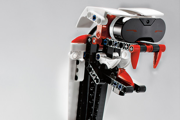
The R3PTAR, a robotic snake from Lego A/S, can be programmed from a smartphone app to attack felines, canines, and siblings — or simply scuttle along the floor and give them something to chase. Equipped with a snapping mechanical jaw and fangs, the serpent might just send even courageous hounds, pusses and pesky kid brothers packing.

R3PTAR is among the new creations the Danish toymaker is counting on to stay relevant in the Internet age. Broadening its product range to attract older users with more complex — and sometimes conflict-driven — toys is helping Lego grow faster than competitors Mattel Inc. (MAT) and Hasbro Inc. (HAS)
Lego’s success “lies in embracing what digital can do,” Chief Marketing Officer Mads Nipper said over coffee in his toy-filled office at company headquarters in Billund, Denmark. As evidence, he points to the 20 million monthly visitors to Lego’s websites and the 100 million-plus copies of video games sold by its licensing partners.

The toymaker has come a long way from the days when it produced yo-yos, ducks and fire trucks made of wood. The company is still controlled by the family of carpenter Ole Kirk Kristiansen, who founded the business in 1932. The family also owns part of Merlin Entertainments Group Ltd, the owner of Lego theme parks.

 
R3PTAR Bite
The R3PTAR is part of a 601-piece set introduced last month that includes a programmable brick, sensors, software and motors. Known as EV3, the $350 set is the third incarnation of the Mindstorms series, introduced in 1998. It includes plans for five walking, talking and thinking robots including the snake, the scorpion-like SPIK3R and the Mohawk-sporting EV3RSTORM.

“These robots have attitude,” said product designer Lars Joe Hyldig, who spent about three years developing them. “They can surprise you” by taking on a mind of their own.
While simple enough to be built by 10-year-olds, Lego says many adults purchase Mindstorms for themselves.
“I’m looking forward to buying some of these for my nieces and nephews and “help” them put them together,” fan Tom Cullen wrote on his Twitter feed Sept. 1.

Lego invited an international group of some adult fans to help create 12 bonus models of the new robots, including an electric guitar and a bulldozer, for which building instructions are accessed online.

 
Angry Faces
The fearsome-looking Mindstorms robots are unlikely to stem criticism from some fans that Lego is straying too far from the toys that have engaged children for generations.
According to a study released this year by university lecturer and former Lego employee Christoph Bartneck, faces on the toymaker’s minifigures have grown angrier in the last four decades as Lego has embraced more conflict-based themes. A set based on The Simpsons television series that’s due next year has also irked members of Lego’s online community, who grouse that it’s not appropriate for the company’s target audience.
“Lego, do not make the Simpsons!” a user called Superfox9783 wrote on an online message board. “It is not a kid-friendly theme! If you do, I will boycott your products.”

 
Physical Play
Such concerns aren’t reflected in Lego’s sales, which are outpacing its primary competitors, helped by both new products and growth in Asia. Revenue in the first half of 2013 increased 13 percent to 10.4 billion Danish kroner ($1.89 billion), versus a 4 percent gain at larger rival Mattel and a slight decline at Hasbro, which it overtook to become the world’s second-biggest toymaker earlier this year.
Mattel has a market capitalization of about $14.3 billion and Hasbro is valued at about $6.1 billion.
Lego has doubled its market share since 2008, according to Robert Porter, an analyst at Euromonitor International in London. Among its top rivals, “Lego has been the most successful of all over the past few years,” Porter said.
Lego controls about 60 percent of the construction toy business, which Euromonitor estimates will grow to more than $10 billion by 2017 from about $7.7 billion in 2012. The traditional toy and game industry was worth about $83 billion last year.
Toy construction line Meccano, known as the Erector Set in the U.S., was acquired by Canadian toy company Spin Master Ltd. earlier this year.
Lego is building new manufacturing facilities in China and plans to expand sales there as rising incomes boost demand, Chief Executive Officer Joergen Vig Knudstorp told Bloomberg Television this month.

 
Colored Bricks
In response to growing demand in emerging markets, the new robots now come with native language editions for Russia, China, Korea, Japan, Spain and Denmark. They used to speak just English, French, German and Dutch.
Lego is now gearing up for Christmas. The company gets 70 percent of its revenue in the last two months of the year. To remain atop Santa’s gift lists, the company recognizes, it must continue freshening its lineup, though without alienating traditional fans.
“It’s very much front of mind,” Chief Financial Officer John Goodwin said while showing off products such as the recently introduced “number train” for toddlers. “We have to keep that newness.”
That doesn’t mean there won’t be a place for the traditional colored building bricks that have long been synonymous with Lego, Goodwin said.
“We still think physical play is going to have a key role even in a digital world,” he said. “Physical creation is something that’s just wired inside all of us, and the joy you get from that can’t fully be replicated via a virtual experience.”


By Katarina Gustafsson

Soure: Bloomberg

Screw it

21 Novembre 2013 Nessun commento


More and more products are using motion activation technology and becoming more intuitive. Good examples are smart phones, video games, segway scooters and most recently screwdrivers. It’s nice to see this technology implemented on a low cost scale because it makes motion activated tech accessible to a larger percentage of us, gadget addicted individuals.

Black & Decker and InvenSense (provider of gyroscopes for Nintendo’s Wii MotionPlus) came together to create the Gyro 4V Max, a motion-activated screwdriver. To use this screwdriver you only have to turn your wrist once to the right or to the left to activate the screwdriver, which will start moving at several different speeds controlled by a gyroscope.

It might seem like a splurge to buy a screwdriver that can start turning on its own without pressing a button, however if you have a lot of screwing to get done, the price tag of $40 could be totally worth it.


By Andrew Krauss

Source: InventRight

Print and production finishes for sustainable design on Rhino Multitool

22 Ottobre 2013 Nessun commento

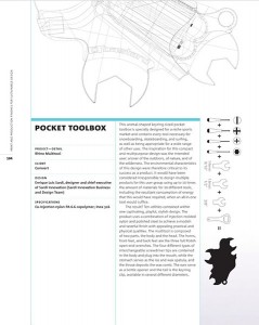
This animal-shaped key ring-sized pocket toolbox is specially designed for a niche sports market and contains every tool necessary for snowboarding, skateboarding and surfing, as well as being appropriate for a wide range of other uses. The inspiration for this compact and multipurpose design was the intended user: a lover of the outdoors, of nature and of the wilderness. The environmental characteristics of this design were therefore critical to its success as a product. It would have been considered irresponsible to design multiple products for this user group using up to 10 times the amount of materials for 10 different tools, including the resultant consumption of energy that this would have required, when an all-in-one tool would suffice.


The result? Ten utilities contained within one captivating, playful, stylish design. The product uses a combination of injection molded nylon and polished steel to achieve a modish and tasteful finish with appealing practical and physical qualities. The multitool is composed of two parts, the body and the head. The horns, front feet and back feet are the three full polish open-end wrenches. The four different types of interchangeable screwdriver tips are contained in the body and plug into the mouth, while the stomach serves as the ice and wax spatula, and the throat deposits the wax comb. The ears serve as a bottle opener and the tail is the key ring clip, available in several different diameters.


Source: Print and production finishes for sustainable design, by Edward Denison

www.sardi-innovation.com

You can buy the book HERE

Young for Italy – Collezione Kokler: uno sguardo contemporaneo sul passato

12 Ottobre 2012 Nessun commento

Sono tante le storie di Young italian che abbiamo voglia di scoprire e raccontarvi. Kökler è una di queste, una storia fatta di passione, forza di volontà e tanta creatività.


kokler, kökler, koekler, materiali pregiati, tradizione, personalità

Kökler, dal turco radici, è il nuovo progetto creato da tre giovani fashion designer di origini diverse, ma molto complementari. Nessuno dei tre è italiano, ma la filosofia creativa del loro progetto rispecchia pienamente i tratti distintivi e tanto celebri del nostro caro Made in Italy: cura del dettaglio, unicità del prodotto, abilità e perizia artigianale.

Emine e Hatice Sagdic sono sorelle, di cultura e sangue turco, ma nate in Germania. Dopo aver studiato filmologia, storia dell’arte e letteratura a Francoforte, si sono trasferite a Milano per intraprendere una formazione di design della moda presso AFOL Moda, dove incontrano Kleant Stasa. Quest’ultimo, d’origine albanese, ha studiato a Genova all’Accademia Liguistica di Belle Arti. Tale scambio reciproco di culture, di lingue e tradizioni diverse, che si dispiega nella nostra Italia, è il loro punto di forza, è l’essenza della loro poetica; infatti, ogni pezzo della Collezione Kökler esprime la storia, il folclore e l’identità delle terre d’origine dei tre designer.


kokler, kökler, koekler, Italian fashion brand, Hatice Sagdic, Emine Sagdic, Kleant StasaUna collezione dalla precisa identità in cui antiche citazioni etniche e pregiate tecniche di lavorazione artigianale si incontrano con “irriverenti” linee asimmetriche, tratti razionali e volumi “trasversali”. È questa la filosofia creativa di Kökler.

La loro estetica non si basa semplicemente sul recupero di un ricordo, sulla citazione di motivi etnici di antica memoria, poichè dietro c’è uno studio viscerale dei processi creativo/artigianali, dell’ingegno, delle tecniche e della cultura da cui questi motivi provengono; per poi proiettare il tutto verso un contesto contemporaneo ed attuale, attraverso abiti dai volumi tridimensionali con tagli audaci e dai forti contrasti cromatici.

I loro abiti, confezionati a mano con l’impiego di tessuti naturali e pregiati, esprimono al contempo delicatezza e grinta, fragilità e audacia, come Rozafa, la giovane protagonista di un’antica leggenda albanese, che come mi spiega Hatice, è stata una fonte d’ispirazione per il loro progetto. Tale contrasto è espresso dal’impiego di differenti tipologie di tessuti in uno stesso abito per conferire quel ritmo tonale che è una delle peculiarità dello stile Kökler.


Made in Italy, High end prêt à porter, moda italiana, prêt à porter Italiano, AFOL Moda

Kokler non è semplicemente un brand, ma un’idea progettuale che spazia dalla moda, alla pittura, alla fotografia.

Kokler è un laboratorio continuo di estro ed inventiva, di bellezza e voglia di fare.

La conclusione viene quasi spontanea: mentre noi italiani fuggiamo dal nostro Bel Paese, i tre giovani protagonisti della mia storia, “pazzi e incoscienti verrà da pensare a qualcuno, ma chi ve lo ha fatto fare, penseranno altri”, vedono nella nostra Italia, quel terreno fertile per condurre la propria indole creativa, per esprimere le proprie passioni e la propria voglia di progettare…

E a noi italiani non rimane che essere orgogliosi di questo!

Sono tanti i progetti futuri che Kökler ha in cantiere, come la sua prima collezione prêt a porter per la prossima stagione. In attesa di poterla ammirare e scrivere su di essa, non ci resta che fare il tifo per voi e dimostrarvi sempre il nostro entusiasmo.


By Valentina Capitano

Source: Italian Touch Boulevard

College designers compete for top solar home crown

28 Settembre 2012 Nessun commento

– Teams from across the globe will soon learn whether their green designs will take top prize at Solar Decathlon Europe 2012 — a competition that challenges collegiate designers to build houses powered exclusively by the sun.


Fold, a house designed by students from the Technical University of Denmark, has walls and a ceiling with adjustable angles to maximize its solar panels’ exposure to the sun.


But beyond their use of photovoltaic panels, these sustainable homes of the future will also be judged on overall design, construction quality and the level of innovation.

The 19 small houses that run solely on solar power were built over two weeks in September at Villa Solar in Madrid, Spain, and provide an architectural spectacle that the public can tour for free.

Teams from Europe, China, Japan, Brazil and Egypt, designed these houses to produce minimal waste throughout the structures’ life cycle.

The lighting, heating and cooling must be fully functional in each house, as do any household appliances inside them, like televisions and ovens. Plumbing is the only component not set up in these showcase homes.

During their final days on display, the houses accumulate points through a series of 10 mini-contests, each measuring specific parameters like architecture, engineering, energy efficiency and market viability. The team with the most points after the final judging wins.

With two more contests to go, a French team’s house, “Canopea,” is leading the pack, followed by a Spanish team’s “Patio 2.12” and an Italian team’s house, called “Med in Italy.”

Ecolar, a team from Germany, is in fourth place right now but its team member, Jakob Winter, says just completing the house the way they had conceptualized it is gratifying enough.

“The most rewarding thing is the feedback of the visitors,” he said. “So many people have come to me after the tour to say what a wonderful building it is, and the atmosphere inside the house. We’re just very happy because we feel the same inside our house.”

Feedback is important for a team like Ecolar, which is one of the teams that already has concrete plans to take its prototype to the market.

“We already have several inquiries from all around the world of people who would very much like to purchase an Ecolar home,” Winter said.

Ecolar won the award for having the best engineering. It is a prefabricated modular home, meaning that they have designed several structures that can all be pieced together in a broader system.

The team enhanced the house’s “passive” temperature regulation to save energy, which meant using hemp in its walls, ceiling and floor for better insulation, and installing clay plates on the ceiling to absorb heat. Like several of the other houses, Ecolar uses vertical, semi-transparent solar panels on the house’s façade, which lets in natural light while helping to supply energy.

Sustainable materials were taken into consideration for most entrants. A team from RWTH Aachen University in Germany, which designed the Counter Entropy House, found several innovative ways to incorporate items normally thought of as unusable: melted CDs were used to build plastic panels for the house’s facade, and salvaged beams and wood from the university’s stadium also served as building material. The house was also designed so that all of its parts can be easily separated for recycling.

Amid the boxy structures, one house, designed by the team from the Technical University of Denmark, took an unusual yet striking shape. The house is called Fold, which looks lopsided with slanted walls and a slanted roof. The angles are meant to be adjustable, depending on where the house is built, to maximize the solar panels’ exposure to the sun.

Like many other of the entrants, Fold produces more energy than it consumes, which means the excess power can be sent through the grid for other uses. At Villa Solar, the prototype houses’ overall surplus energy powers event spaces.

The competition was spun off from the original Solar Decathlon held biannually by the U.S. Department of Energy in Washington, D.C., and is the result of an agreement between the U.S. and Spain, which is hosting the European edition for the second time.


By Vanessa Ko
Source: //edition.cnn.com

How to stabilize a wobbly table

12 Settembre 2012 Nessun commento

You are in a restaurant and you find that your table wobbles. What do you do? Most people either put up with it, or they attempt to correct the problem by pushing a folded table napkin under one of the legs. But Yeople’s guys can go one better.

Challenges to Integrating Sustainable Product Design and LCA

6 Agosto 2012 Nessun commento

if there’s one common thread that binds product designers, researchers, and engineers, it’s the passion to create products that have a positive impact on the world. More and more, sustainability is an important facet of the impact we’re all striving to create. Consumers, retailers, and brands are quickly realizing that the best solutions are ones that are good for businesses, good for people, and good for the planet – forward-thinking product design firms already know this. The benefits of a slight reduction in the environmental impact of a single product that sells in the millions will quickly surpass the benefit of all the recycling and composting we could ever do in our offices.

While there are a variety of approaches to creating more sustainable products that have been around for years (e.g. the Eco-Strategy Wheel and Design for X), life cycle analysis (LCA) is now recognized as the most complete approach to depict a product’s impact. As an assessment tool, LCA is excellent, and can provide high quality information for reporting as well as for planning project re-designs. But when you’re neck deep in the development process, the product itself is a moving target. There’s truth in the old adage that “You can’t manage what you can’t measure.” The problem is, you can’t measure it if it doesn’t yet exist.

This article is the first of a three part series based on a collaboration between Carbon Design Group, a product design and development firm, and EcoShift, a sustainability and LCA consultancy. It looks at the complex challenges of sustainable product design, the current state of LCA practices and tools, and our vision of integrating sustainability throughout the development process. In this introductory piece, we’ll focus on why and how product development consultancies are stepping up to sustainability, and the significant challenges that arise from this.


Source:  www.carbondesign.com


999 Bottles launch buzz: Fastco, Mashable, Treehugger, HuffPo and others

3 Agosto 2012 Nessun commento

We closed the first week on Kickstarter with a splash! Almost 400 people have pledged to help us make the first run of 999Bottles a reality, bringing us close to 20% of our goal! We will be sharing some news in the next few weeks, but first we wanted to thank the great support from the press!

“The 999Bottle is the work of Fernd van Engelen at Artefact. It’s a smart, simple way to make the impact of a reusable water bottle more tangible; putting a number on it makes it more of an accomplishment[…] It’s a conversation starter, too, not to mention that the bottle itself looks great, made of stainless steel with a rubberized base.” Alex Dravis, Treehugger

“…these sobering facts have sparked the reusable bottle movement over the past few years, Ferd van Engelen and his colleagues at the Seattle based Artefact Group have taken it a step further, creating the 999Bottles water bottle, a 24 ounce reusable water bottle that allows its users to see exactly how abandoning disposable plastic bottles can help sustainability” Drew Guarini, Huffpo

“Late last year, Artefact shared with us a unique concept for a reusable water bottle. It was nice to look at, to be sure, but the truly innovative twist was it reinforced the virtuous choice to forgo the plastic variety: a built-in dial would allow users to keep track of how many plastic water bottles they were saving from a landfill, and an app would help them visualize their environmental impact. Back then, our question to Artefact’s Fernd van Engelen was: “How much money would you need to bring this concept to reality?” He replied in the form of a Kickstarter campaign” Belinda Lanks, Fastco


Source: http://www.artefactgroup.com/#/content/999bottles-launch-buzz-fastco-mashable-treehugger-huffpo-and-others

L’ecovillaggio made in Brianza in mostra al Maxxi di Roma

9 Luglio 2012 Nessun commento

Rimarrà esposto in maniera permanente al Maxxi di Roma come unico prototipo del suo genere tra i 10 progetti scelti. Si tratta di NuEvo, un modulo abitativo progettato e realizzato in Brianza da un gruppo di imprese che hanno fatto sistema e hanno sviluppato un contratto di rete – InfraBuild – per creare sul territorio e diffondere a livello nazionale il progetto a cura dell’ architetto Federico Pella di Sering.

Dietro a NuEvo, ovvero il modulo-base di EcoVillage, in esposizione a Roma, c’è una una filiera di una ventina di aziende lombarde ed in particolar modo brianzole, legate a Confindustria Monza e Brianza che hanno deciso non solo di


progettare ma anche di sviluppare un modulo abitativo che si basa sul l’utilizzo di tecnologie costruttive sostenibili e sistemi energetici all’avanguardia, e che può portare allo sviluppo di ecovillage, villaggi e quartieri auto-sostenibili, sia a livello funzionale che energetico.

Le imprese che lavorano al progetto: Bms im- pianti, Lettera g , Giovanardi, Parà, Malegori,Officine Locati, Seccar, Vetraria Cogliati, Resin-glas, Masserdotti,  Nice, Graniti fiandre, Fontana Arte,Visal Serramenti, meregalli impianti, Prisca design, Comoparquet, Infrabuild.


Al Maxxi di Roma sono invece esposti fino al 29 luglio i prototipi di case ecologiche costruite sulla base dei progetti vincitori del Consulto Eco_Luoghi 2011.


To know more about this project visit: www.nuevoformat.it