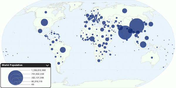
Use infographics to boost your credibility and traffic
A few years ago I stumbled upon a study that tried to prove the significant difference between visual and textual information. According to this study, visual information — when presented clearly — trumped textual information by tenfold, and uncovered that 90 percent of all information we remember was based on visual impact.
While this theory sounds absolutely groundbreaking, the reality is that the world around us has always been infused with visual information.
Not everyone may be familiar with the term infographic since it is rather new; you may come across it disguised in fancy words like “data visualization” or “information design.”
What Are Infographics?
According to Wikipedia, infographics are “graphic visual representations of information, data or knowledge intended to present complex information quickly and clearly.”
Simply put, it means taking data, organizing it, and making it visually digestible by converting it into graphs, charts, maps, and visual stories. Without having to read large amounts of text, the viewer can easily process the information that is being shared and is given the chance to explore a topic in a highly engaging way.
8 Reasons Why Infographics Work
Let’s review why data visualization is so effective:
- Most of us tend to have shorter and shorter attention spans, for which (unsurprisingly) looking at a captivating image beats out reading large amounts of text.
- We are constantly exposed to information overload via our computers, tablets, and smartphones. The key is no longer to get the information out there, but to get attention for it.
- Human beings are highly visual, and can absorb visual information faster and more easily than other kinds of information.
- Most people forget a large amount of what they’ve read, but they do remember what they’ve seen.
- Infographics are more fun and engaging than plain text.
- Infographics done right do not only make it easier to understand complex information, but boost both the creator’s profile and website traffic.
- Infographics allow the creator to showcase his or her knowledge about a certain topic.
- A good infographic can spread quickly on the Internet, giving other bloggers and writers something to talk about, and the creator backlinks and exposure. Be sure to include a logo and URL on the image for copyright purposes.
How Your Business Can Benefit from Infographics
Infographics are collages of information created to entertain, engage, and educate an audience. Nearly any topic can provide enough material to transform static text into an interesting visual, and therefore provide an informative and memorable reading/viewing experience at the same time.
Giving your audience something they can repost and share with friends increases your chances of being shared all across the Internet – be it on blogs, social media, or news sites.
Building a Great Infographic in 3 Steps
Step 1 – Pick your topic
When choosing a topic, be open to subjects that might not solely revolve around your business. Be selfless and pick something that is of common interest (but do ensure there is a close connection to your business or professional background in order to establish your expertise). Rather than creating an infographic of “The 5 Things I Do in My Restaurant,” create an infographic that is more generic and universally usable: “Management Practices of Restaurants in the U.S.”
Be ready to dig deep to retrieve valuable and little-known information. The key is to provide unparalleled value!
Step 2 – Design your infographic
Once you’ve assorted all your information, it is time to visualize the information in the most creative — yet logical — way possible. Split your information up into categories and try to determine the size and layout of your categories. Take a minute and search on Pinterest to draw inspiration from hundreds of great infographics!
Remember one thing: do not try to move mountains but think pragmatically. If your infographic is about restaurants, use icons, graphics, colors, and shapes that you would find in restaurants (i.e., to showcase the amount of soups ordered, use spoons; to showcase the amount of main courses ordered, use forks & knives. If soups represent 10% and main courses 90%, you could place 10 spoons next to 90 forks & knives to illustrate the ratio.
Be creative about the way you display facts but do not try to go overboard and make your infographic too complex. Remember that infographics are meant to simplify understanding, not complicate it further!
Step 3 – Give yourself credit for your work
Be sure to include your credentials on the infographic. Claim it as your own because this is the reward you are getting from sharing it. You can include your logo, your sources of information, and your domains in the infographic. It’s your masterpiece and you have the rights to claim it as your own!
Here is an interesting infographic produced by my AllBusiness colleague Matthew Faustman’s firm: How Intellectual Is Your Property? Notice how it communicates a huge amount of information more easily by using a variety of interesting visuals.
Where to Post Your Infographic
In most cases, the objective of creating an infographic is for it to be found, seen, and shared. There are no limits to where your infographic can be posted.
Definitely showcase your masterpiece of information design on your own blog or website (if applicable). Share it via your social media channels: Twitter, Facebook, and definitely visual sites such as Pinterest! Allow others to use your infographic in their articles and posts, but ask that they include a link back to your website or add an image credit note at the bottom.
Being able to pack information into a visual experience is a great opportunity to get your point across, drive interest and traffic, get exposure, and build your reputation as an expert.
By: Melanie Haselmayr
Source: AllBusiness


